
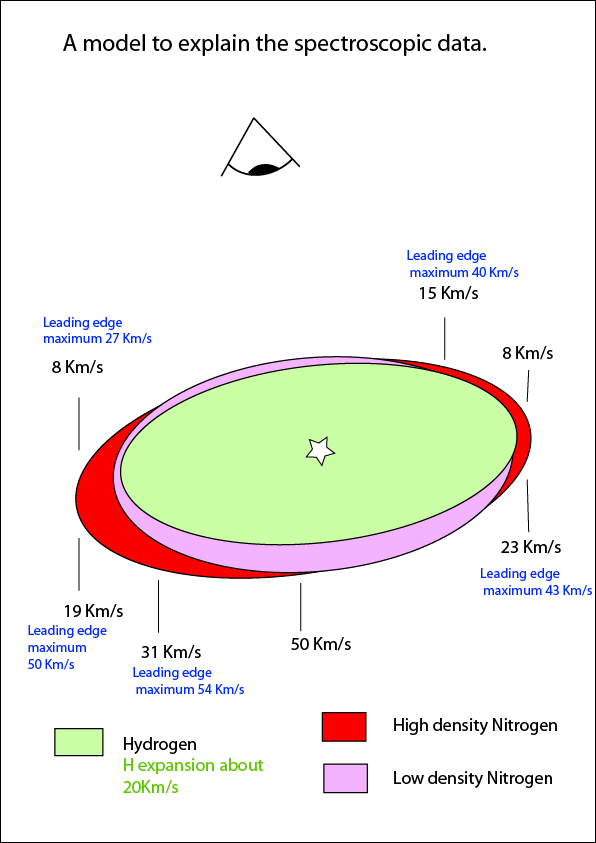
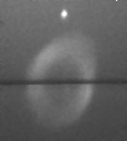
The model shows a slice through the nebula along the line of the slit, so this image represents depth through the nebula with the bottom receding edge being furthest from the observer. The left hand side corresponds to the left side of the slit image.
If we consider the nitrogen rich regions as the equator, then you might explain the thinner region about the poles with higher velocity winds in this region, both during the AGB phase (precursor to the planetary nebula phase, slower winds) and during the planetary nebular (PN) phase (much high velocities), spreading the nitrogen further and more evenly over time. If the material at the equator were not dispersed as greatly during the AGB stage, then there would be regions of higher density nitrogen that could be compressed in the PN phase. The question that I am then left with is "why should there be winds with greater velocity in the polar region if this is what is happening" ?
If we look at our Sun, it is known that there are holes in the corona at the poles and that the solar wind is almost twice that found emminating from the equator. The wind at the poles is about 800km/s, and although it is not known why there should be two components to the solar wind like this, it has been suggested that it is to do with the magnetic field lines and that at the poles the field lines extend out into space. If something like this was happening during the AGB phase of the star that created M57, this could explain the distribution of the gasses seen in the nebula.
Another question that I find interesting is "why is the chemical composition enriched in nitrogen in some regions"? My best thoughts on this at the moment are that these nitrogen enriched clouds were produced during the AGB phase where the star is shedding mass. This suggests that at some point the outer layer that was being shed was high in nitrogen relative to the other elements that can be observed in the above data. It would be interesting to be able to measure the ratio of carbon and oxygen to nitrogen in these clouds but I am not sure how or if I could do this yet. There does seem to be differentiation in the nitrogen and oxygen data shown above.
This all raises more questions than I have answers for, but it does keep the mind active!
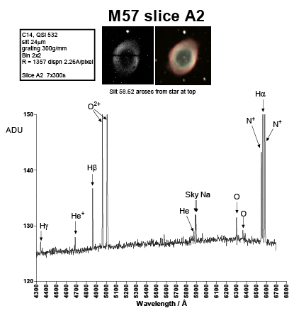
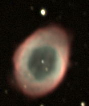
Below is an image to show the position of the slit adjacent to the colour picture of M57. The spectrum was taken on 21 September 2010.
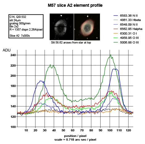
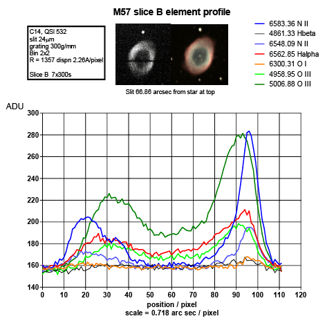
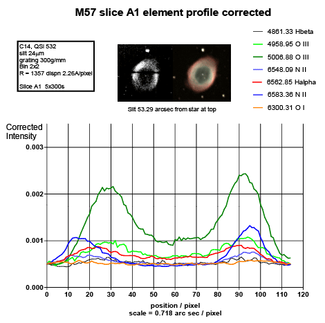
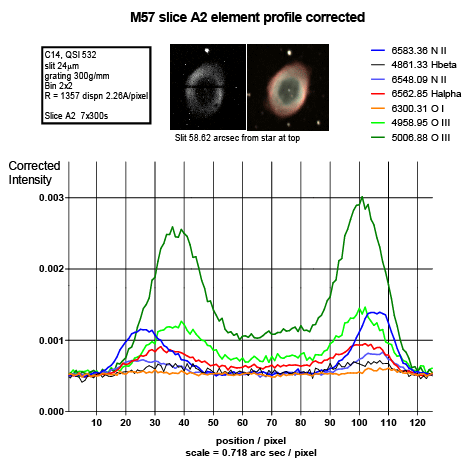
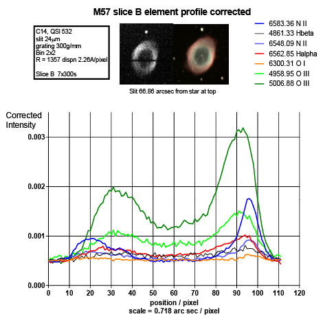
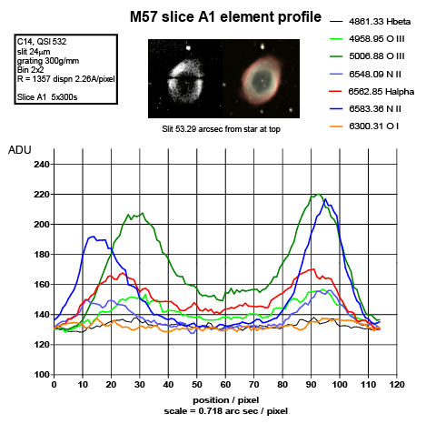
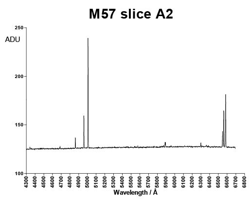
In the colour pictures, the green colour largely comes from the O2+ emission lines and the red colour at the very edges can be seen to largely come from the N+ emission lines.
The N+ distribution relative to the O2+ is interesting in that it is different on the left and right. It looks like the density is greater on the right, particularly on the edge of slice B (a sharp edge to the nebula or perhaps radiation bound) with a more diffuse tail off on the left side.
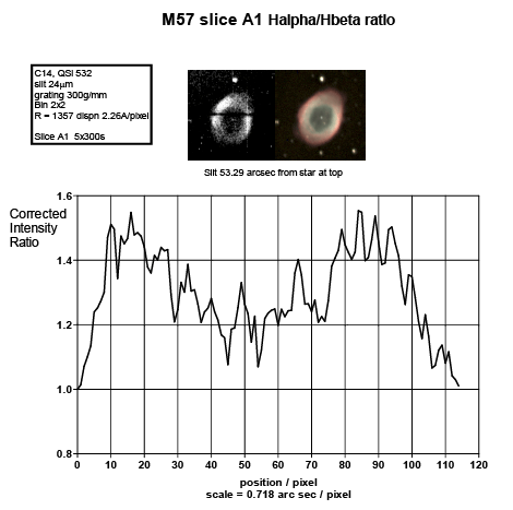
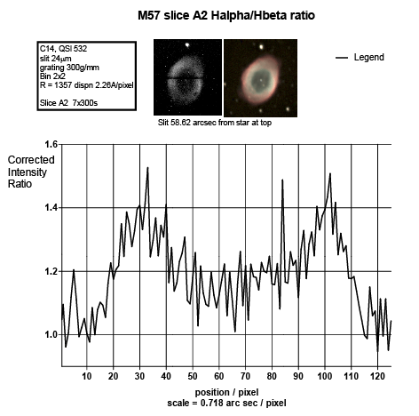
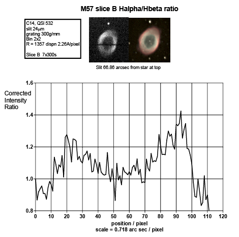
At the outer edges the Hbeta decreases, in the ring the Halpha is higher and the Hbeta is dropping. In the central part the Hbeta emission to Halpha is constant. The central region is the easiest to explain, the radiation is intense and the gas density is lower so direct UV excitation processes dominated. As you move further out from the central star, the gas density increases, there is a consequential decrease in the available high energy photons, lower energy photons are still available directly from the star and through photon release from high energy excited ions. These lower energy photons can still give rise to an excited state that will produce a Halpha emission. It is also possible that as the density of the nebula increases that there is an increase in the partial transfer of energy from excited species through non-radiative processes that increases the population of lower energy excited species which can give rise to Halpha emission.
The data here is presented with my own interpretation. This is not my field of expertise, stellar gas cloud spectroscopy is some way from a synthetic chemistry lab, so the reader is advised to make their own assessments on how accurate the statements are.
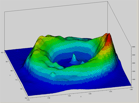
The luminance filter allows all the visible wavelengths through, so is a combination of all the wavelengths recorded in the spectra above. As can be seen, the general pattern is as expected with the right side being more intense than the left, while the left side is broader.
It should be remembered that this is a plot of intensity from a flat picture, so the 3D structure does not represent the 3D structure of the ring. The data has also not been corrected for instrument response.
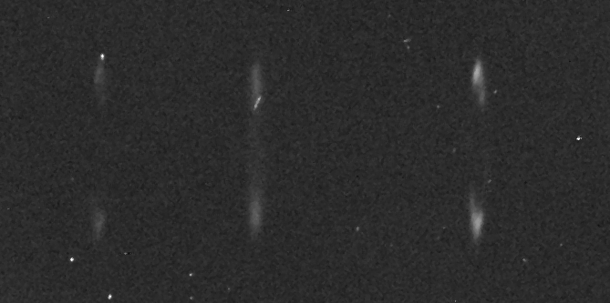
Of interest is that it is not smooth, there are variations in intensity which, when viewed in combination with the spectral data above can be seen to reflect variations in gas density and composition. It is hard to see how this would occur otherwise. The two peaks in the centre are stars, one is the central nebula star and the other is a background star that is coincidental to our line of sight.
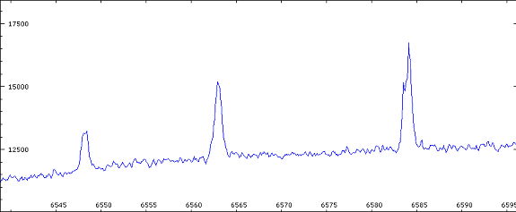
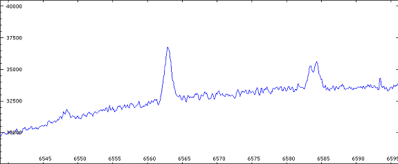
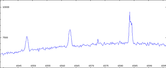
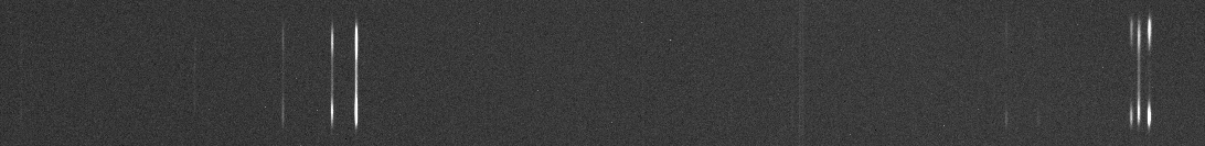
The image on the right shows the N II (6548A), Halpha (6563A) and N II (6583) lines from left to right. Because this was a single exposure it was not possible to remove the cosmic ray strike across the Halpha or the hot pixel at the top of the first N II line. Fortunately the N II (6583) line which is the most interesting was clean.
The N II line clearly shows both red shift and blue shift components and from this the rates of expansion can be calculated. In comparison to the N II line, the Halpha can be seen to be much more evenly spread.
Some plots of this data can be seen below: